
 This post is an excerpt from my upcoming book .NET MAUI in Action. The book is available now in early access, so you can sign up now to get more content like this as it becomes available. And use the code fccgoldman for an extra 25% off.
In this post for .NET MAUI UI July, I’m going to show how we can use a combination of .NET MAUI’s built in layouts and controls to replicate a familiar UI: the Microsoft Outlook mobile app.
Figure 1 shows Outlook running on iOS.
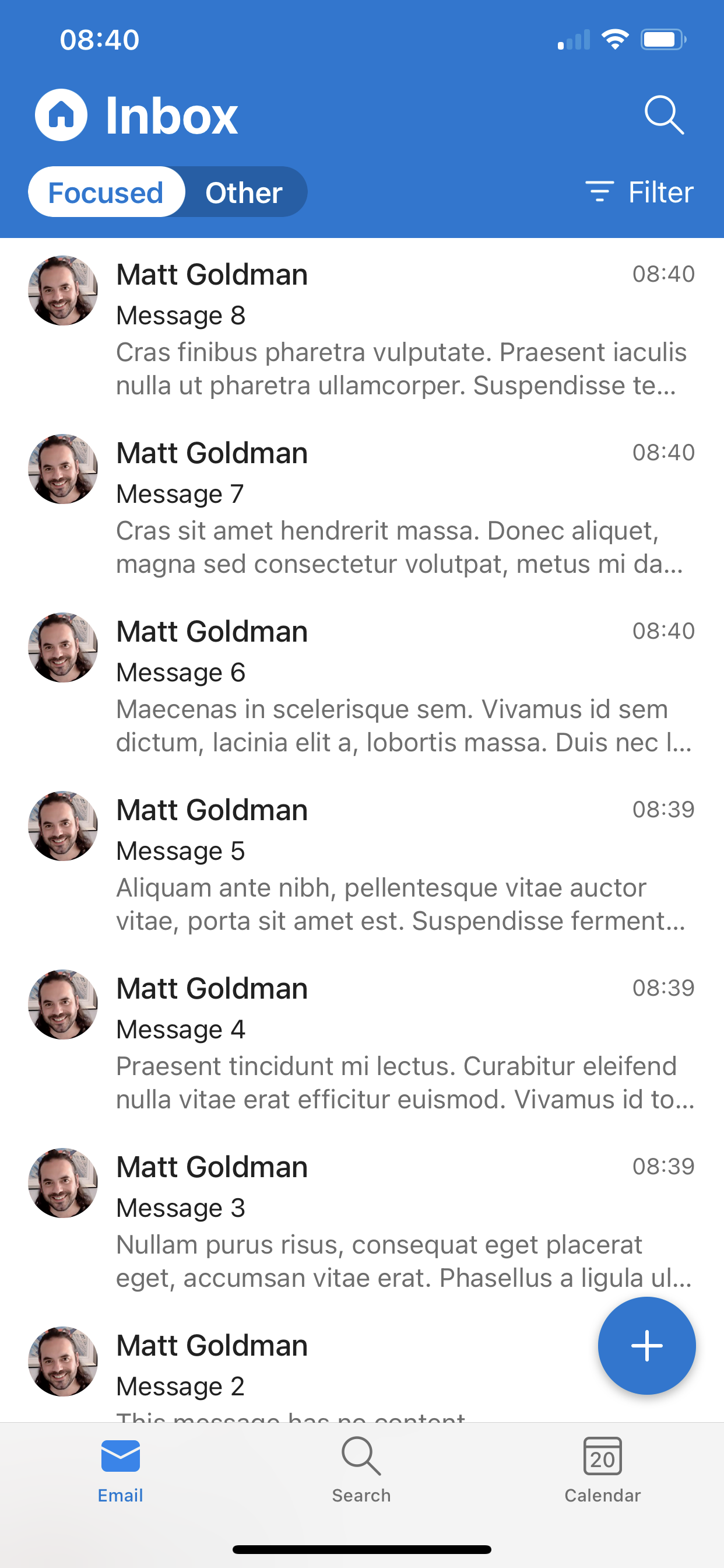
Figure 1 Microsoft Outlook running on iOS.
We’re going to recreate this UI using .NET MAUI. We’re not going to build any of the functionality Outlook provides, we’re just going to recreate the UI of the Inbox screen to exercise our skills in building UIs with .NET MAUI.
Building the Outlook UI
Let’s get started! Create a new .NET MAUI app and call it OutlookClone.
Outlook uses Microsoft’s Fluent icons, which we can get from the GitHub repository here: https://github.com/microsoft/fluentui-system-icons. The icons are available in various formats but we’ll use the font icons.
Download the two font files (FluentSystemIcons-Filled.ttf and FluentSystemIcons-Regular.ttf), import them into the Resources/Fonts folder, and register the fonts in MauiProgram.cs.
1
2
3
4
5
6
7
8
9
10
11
12
13
14
15
16
17
18
19
20
21
namespace OutlookClone
{
    public static class MauiProgram
    {
        public static MauiApp CreateMauiApp()
        {
            var builder = MauiApp.CreateBuilder();
            builder
                .UseMauiApp<App>()
                .ConfigureFonts(fonts =>
                {
                    fonts.AddFont("OpenSans-Regular.ttf", "OpenSansRegular");
                    fonts.AddFont("OpenSans-Semibold.ttf", "OpenSansSemibold");
                    fonts.AddFont("FluentSystemIcons-Filled.ttf", "FluentFilled");
                    fonts.AddFont("FluentSystemIcons-Regular.ttf", "FluentRegular");
                });

            return builder.Build();
        }
    }
}
I used https://andreinitescu.github.io/IconFont2Code/ to figure out what glyphs to use, and to use them in XAML just replace ‘\u’ with ‘&#x’ and add an ending semicolon.
Now that we’ve got the fonts registered, let’s register the colours (I used a colour picker tool). I’ve registered these in App.xaml to simplify the code listing; you can also register them in Resources/Styles.xaml.
1
2
3
4
5
6
7
8
9
10
11
12
13
<?xml version = "1.0" encoding = "UTF-8" ?>
<Application xmlns="http://schemas.microsoft.com/dotnet/2021/maui"
             xmlns:x="http://schemas.microsoft.com/winfx/2009/xaml"
             xmlns:local="clr-namespace:OutlookClone"
             x:Class="OutlookClone.App">
    <Application.Resources>
        <ResourceDictionary Source="Resources/Styles.xaml">
            <Color x:Key="Primary">#0878d3</Color>
            <Color x:Key="Secondary">#f1edec</Color>
            <Color x:Key="Tertiary">#717171</Color>
        </ResourceDictionary>
    </Application.Resources>
</Application>
The top-level Grid
At the top level, we can break the UI down into four rows. It’s tempting to combine the top two rows, and break them down internally, but I’ve chosen to make them individual rows in the top-level grid to give more control in relation to the page’s size as a whole.
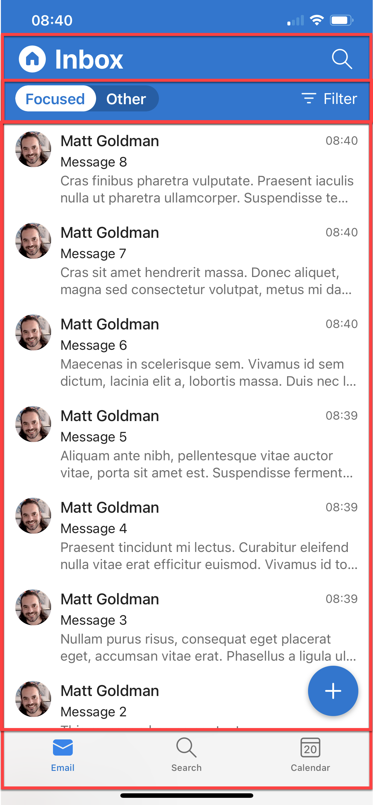
Figure 2 The Outlook Inbox UI broken down as rows in a Grid. We’ve ignored the status bar and safe area. Using this approach, we can see that we have four rows. The top row has the title and search, the next row which has the focused inbox switch and the filter button. At the bottom we can see the tab bar, and between the second and fourth rows is the list of messages, which takes up all the remaining space.
Next, we have the list of messages, and at the bottom we have the tab bar. In a real-world app, we would use Shell or a TabbedPage to provide these tabs (or import or build a tab bar) but we’re just replicating the UI here, so we’ll build the tabs.
Looking at this top-level Grid, I can see that the top row (row 0) is slightly larger than the second row (row 1), and that the last row (row 3) is slightly larger still; a close enough approximation which gives us row heights of 50, 40, * and 80. Let’s add this to MainPage.xaml.
1
2
3
4
5
6
7
8
<?xml version="1.0" encoding="utf-8" ?>
<ContentPage xmlns="http://schemas.microsoft.com/dotnet/2021/maui"
             xmlns:x="http://schemas.microsoft.com/winfx/2009/xaml"
             x:Class="OutlookClone.MainPage">

    <Grid RowDefinitions="50,40,*,80">
    </Grid>
</ContentPage>
The top row
We’ll use a FlexLayout for the top row of the Grid, which will let us easily position the child items at the start and end using SpaceBetween. Inside this FlexLayout we can use HorizontalStackLayout to position the icon and title at the start, and a Label to position the icon at the end.
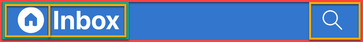
Figure 3 We can use a FlexLayout to arrange the top row, using SpaceBetween to position the child views on either side. On the left we can use a HorizontalStackLayout with two Labels (one for the icon and one for the title), and a Label for the search icon on the right.
1
2
3
4
5
6
7
8
9
10
11
12
13
14
15
16
17
18
19
20
21
22
23
24
25
26
27
28
29
30
31
32
33
34
35
36
37
38
39
40
41
42
43
44
45
46
47
48
49
50
51
52
53
54
55
56
57
<?xml version="1.0" encoding="utf-8" ?>
<ContentPage xmlns="http://schemas.microsoft.com/dotnet/2021/maui"
xmlns:x="http://schemas.microsoft.com/winfx/2009/xaml"
x:Class="OutlookClone.MainPage">
<Grid RowDefinitions="50,40,*,80">
<FlexLayout Grid.Row="0"
HorizontalOptions="FillAndExpand"
VerticalOptions="FillAndExpand"
BackgroundColor="{StaticResource Primary}"
JustifyContent="SpaceBetween">
<HorizontalStackLayout Margin="5,0,0,0"
Spacing="10">
<Label Text="器"
FontFamily="FluentFilled"
TextColor="{StaticResource Primary}"
HorizontalTextAlignment="Center"
HorizontalOptions="StartAndExpand"
VerticalTextAlignment="Center"
BackgroundColor="White"
VerticalOptions="Center"
WidthRequest="30"
HeightRequest="30"
FontSize="Large">
<Label.Clip>
<EllipseGeometry RadiusX="15"
RadiusY="15"
Center="15,15"/>
</Label.Clip>
</Label>
<Label Text="Inbox"
VerticalTextAlignment="Center"
HorizontalOptions="StartAndExpand"
TextColor="White"
FontAttributes="Bold"
FontSize="Large"/>
</HorizontalStackLayout>
<Label Text="ﬦ"
FontFamily="FluentRegular"
TextColor="White"
VerticalOptions="Center"
HorizontalOptions="EndAndExpand"
HorizontalTextAlignment="End"
WidthRequest="40"
FontSize="Large"
Margin="0,0,5,0"/>
</FlexLayout>
</Grid>
</ContentPage>
The second row
We’ll use a FlexLayout for the second row too. Building the focused inbox switch is outside the scope of this exercise (building custom controls is covered in .NET MAUI in Action), so we’ll use some artistic license and replace it with a standard Switch and a Label. We’ll place these inside a HorizontalStackLayout and use a second HorizontalStackLayout at the end of the FlexLayout for the filter icon and label.
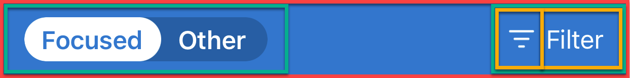
Figure 4 We can use a FlexLayout to arrange the second row, using SpaceBetween to position the child views on either side. On the left is the focused inbox switch control, and on the right is a HorizontalStackLayout with two child Labels: one for the icon and the second for the word ‘Filter’.
1
2
3
4
5
6
7
8
9
10
11
12
13
14
15
16
17
18
19
20
21
22
23
24
25
26
27
28
29
30
31
32
33
34
35
36
37
38
39
40
41
42
43
44
45
46
47
48
49
50
<?xml version="1.0" encoding="utf-8" ?>
<ContentPage xmlns="http://schemas.microsoft.com/dotnet/2021/maui"
xmlns:x="http://schemas.microsoft.com/winfx/2009/xaml"
x:Class="OutlookClone.MainPage">
<Grid RowDefinitions="50,40,*,80">
<FlexLayout …>
...
</FlexLayout>
<FlexLayout Grid.Row="1"
HorizontalOptions="FillAndExpand"
VerticalOptions="FillAndExpand"
BackgroundColor="{StaticResource Primary}"
Padding="20,5"
JustifyContent="SpaceBetween">
<HorizontalStackLayout Margin="5,0,0,0">
<Label Text="Focused"
TextColor="White"
VerticalOptions="Center"/>
<Switch/>
</HorizontalStackLayout>
<HorizontalStackLayout Margin="0,0,5,0"
Spacing="10">
<Label Text=""
FontFamily="FluentRegular"
TextColor="White"
VerticalOptions="Center"
HorizontalOptions="EndAndExpand"
HorizontalTextAlignment="End"
WidthRequest="40"
FontSize="Large"/>
<Label Text="Filter"
TextColor="White"
VerticalOptions="Center"
HorizontalOptions="EndAndExpand"
HorizontalTextAlignment="End"/>
</HorizontalStackLayout>
</FlexLayout>
</Grid>
</ContentPage>
The main section
The main section of the page is row 2, the messages. CollectionView lends itself to this kind of control. We can also see there’s a floating action button (FAB) in the corner.
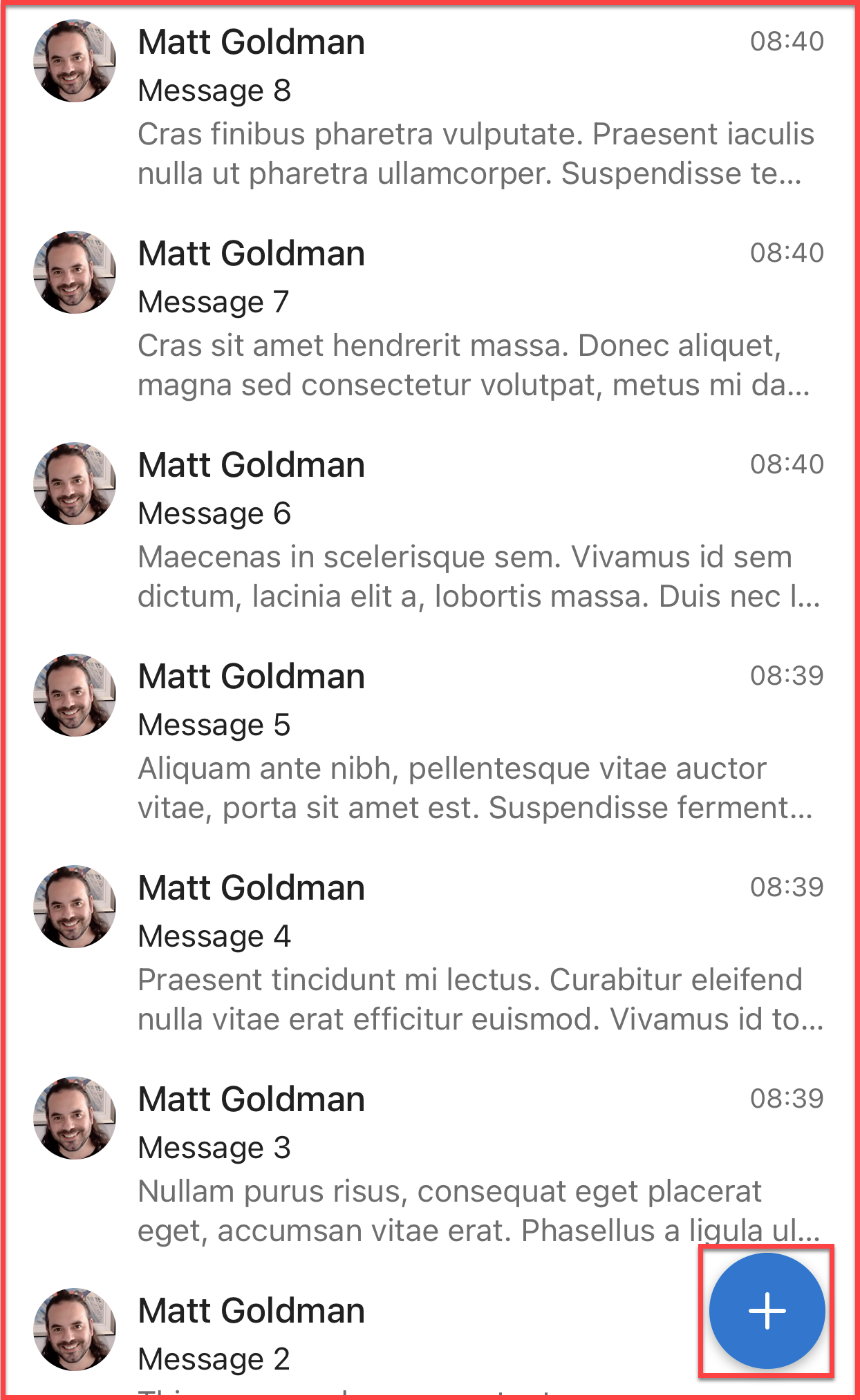
Figure 5 Using CollectionView for the third row is a no-brainer, but we can see there’s a floating action button in the bottom right-hand corner too. This can be in the same row (there’s only one column) and we can use HorizontalOptions and VerticalOptions to position it at the end.
We can use a Grid for the messages in the collection, with three columns and three rows.
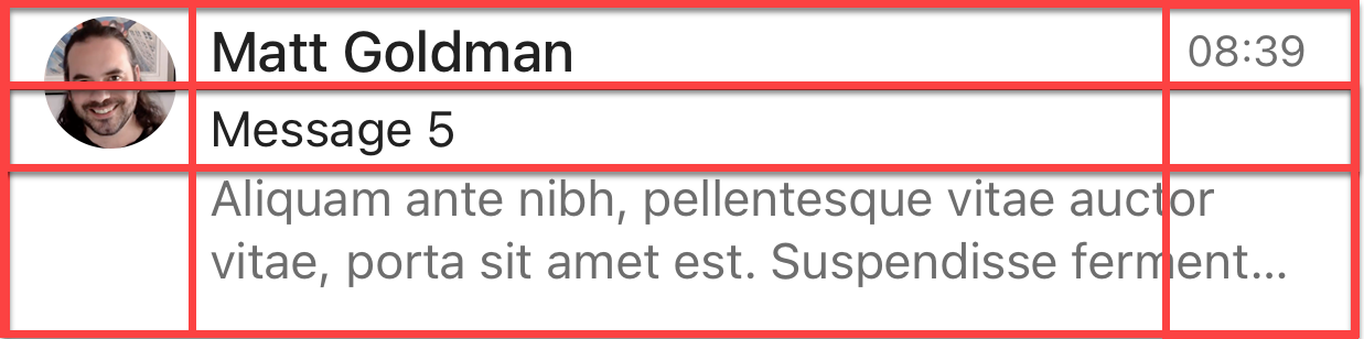
Figure 6 The message template for the Inbox can be laid out as a Grid, with three columns and three rows. The avatar will reside in the first column and row and will have a row span of 3 (there’s nothing else in the first column). The sender’s name will go into the first row, second column. The subject will go into the second row, second column, and the message body preview will go into the third row, second column, and will span into the third column too. The time or day when the message was sent will go into the first row, third column.
I’m using an API that generates random quotes from The Simpsons to populate my dummy message list, so knowing the structure of the class I’m using, I can use properties of that class for the bindings in the template.
1
2
3
4
5
6
7
8
9
10
11
12
13
14
15
16
17
18
19
20
21
22
23
24
25
26
27
28
29
30
31
32
33
34
35
36
37
38
39
40
41
42
43
44
45
46
47
48
49
50
51
52
53
54
55
56
57
58
59
60
61
62
63
64
65
66
67
68
69
70
71
72
73
74
<?xml version="1.0" encoding="utf-8" ?>
<ContentPage xmlns="http://schemas.microsoft.com/dotnet/2021/maui"
             xmlns:x="http://schemas.microsoft.com/winfx/2009/xaml"
             x:Class="OutlookClone.MainPage">

    <Grid RowDefinitions="50,40,*,80">
        <FlexLayout …>
		    ...
        </FlexLayout>

        <FlexLayout …>
		    ...
        </FlexLayout>

        <CollectionView Grid.Row="2"
                        x:Name="MessageCollection"
                        HorizontalOptions="Fill"
                        VerticalOptions="Fill">
            <CollectionView.ItemTemplate>
                <DataTemplate>
<Grid ColumnDefinitions="50,*,50"
                          RowDefinitions="25,20,40"
                          HorizontalOptions="Fill"
                          VerticalOptions="Fill"
                          Padding="10,5,20,5">

                        <Image WidthRequest="40"
                               HeightRequest="40"
                               Grid.RowSpan="3"
                               VerticalOptions="Start"
                               HorizontalOptions="Start"
                               Aspect="AspectFill"
                               Source="{Binding image}">
                            <Image.Clip>
                                <EllipseGeometry RadiusX="20"
                                                 RadiusY="20"
                                                 Center="20,20"/>
                            </Image.Clip>
                        </Image>

                        <Label Grid.Row="0"
                               Grid.Column="1"
                               Text="{Binding character}"
                               FontSize="18"
                               FontAttributes="Bold"
                               TextColor="Black"/>

                        <Label Grid.Row="1"
                               Grid.Column="1"
                               Text="{Binding quote}"
                               LineBreakMode="TailTruncation"
                               VerticalOptions="Start"
                               TextColor="Black"/>

                        <Label Grid.Row="2"
                               Grid.Column="1"
                               Grid.ColumnSpan="2"
                               Text="{Binding quote}"
                               LineBreakMode="WordWrap"
                               VerticalOptions="Start"
                               TextColor="{StaticResource Tertiary}"/>

                        <Label Grid.Row="0"
                               Grid.Column="2"
                               Text="Saturday"
                               FontSize="12"
                               TextColor="{StaticResource Tertiary}"/>
                    </Grid>
                </DataTemplate>
            </CollectionView.ItemTemplate>
        </CollectionView>

    </Grid>
</ContentPage>
And then let’s add the FAB which is pretty simple:
1
2
3
4
5
6
7
8
9
10
11
12
13
14
15
16
17
18
19
20
21
22
23
24
25
26
27
28
29
30
31
32
33
34
35
36
<?xml version="1.0" encoding="utf-8" ?>
<ContentPage xmlns="http://schemas.microsoft.com/dotnet/2021/maui"
             xmlns:x="http://schemas.microsoft.com/winfx/2009/xaml"
             x:Class="OutlookClone.MainPage">

    <Grid RowDefinitions="50,40,*,80">
        <FlexLayout …>
		    ...
        </FlexLayout>

        <FlexLayout …>
			...
        </FlexLayout>

	   <CollectionView …>
	   </CollectionView>

        <Button Grid.Row="2"
                BackgroundColor="{StaticResource Primary}"
                HorizontalOptions="EndAndExpand"
                VerticalOptions="EndAndExpand"
                Margin="20"
                HeightRequest="60"
                WidthRequest="60"
                CornerRadius="30"
                FontSize="30"
                Text="+">
            <Button.Shadow>
                <Shadow Brush="Black"
                        Offset="5,5"
                        Radius="10"
                        Opacity="0.5"/>
            </Button.Shadow>
        </Button>
    </Grid>
</ContentPage>
I’d also like to add an ActivityIndicator to show while the data is loading.
1
2
3
4
5
6
7
8
9
10
11
12
13
14
15
16
17
18
19
<?xml version="1.0" encoding="utf-8" ?>
<ContentPage xmlns="http://schemas.microsoft.com/dotnet/2021/maui"
             xmlns:x="http://schemas.microsoft.com/winfx/2009/xaml"
             x:Class="OutlookClone.MainPage">

    <Grid RowDefinitions="50,40,*,80">

		...

        <ActivityIndicator Grid.Row="2"
                           Color="{StaticResource Primary}"
                           IsRunning="True"
                           IsEnabled="True"
                           VerticalOptions="Center"
                           HorizontalOptions="Center"
                           x:Name="LoadingIndicator"/>

    </Grid>
</ContentPage>
The tab bar
To build the tab bar, we’ll add a Grid to the fourth row (row 3) of the page’s top-level Grid. It will have three columns, one for each tab, and within each column will be a VerticalStackLayout to arrange the tab’s icon and label.
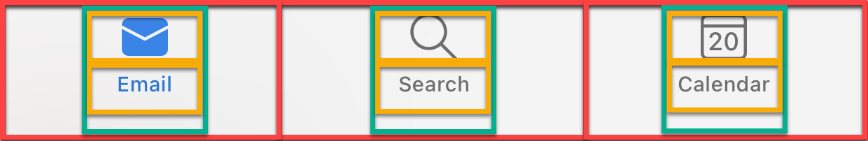
Figure 7 The last row is the tab bar. We’ll use another Grid for this part, with three columns. In each column we’ll use a VerticalStackLayout with two Labels as child items; one for the tab icon and one for the tab label.
Let’s start by adding the Grid. Listing 9 shows the code for MainPage.xaml with the tab bar Grid added in bold. Most of the remaining code has been omitted for brevity.
1
2
3
4
5
6
7
8
9
10
11
12
13
14
15
16
17
18
19
20
21
22
23
24
25
26
27
28
29
30
31
32
33
34
35
36
37
38
39
40
41
42
43
44
45
46
47
48
49
50
51
52
53
54
55
56
57
58
59
60
61
62
63
64
65
66
67
68
69
70
71
72
73
74
75
76
77
78
79
80
81
82
83
84
85
86
87
88
89
90
91
92
93
94
95
96
97
98
99
100
<?xml version="1.0" encoding="utf-8" ?>
<ContentPage xmlns="http://schemas.microsoft.com/dotnet/2021/maui"
xmlns:x="http://schemas.microsoft.com/winfx/2009/xaml"
x:Class="OutlookClone.MainPage">
<Grid RowDefinitions="50,40,*,80">
<FlexLayout …>
...
</FlexLayout>
<FlexLayout …>
...
</FlexLayout>
<Button …>
...
</Button>
<Grid Grid.Row="3"
HorizontalOptions="FillAndExpand"
VerticalOptions="FillAndExpand"
ColumnDefinitions="*,*,*"
Padding="5"
BackgroundColor="{StaticResource Secondary}">
<VerticalStackLayout HorizontalOptions="Center"
Grid.Column="0">
<Label Text=""
FontFamily="FluentFilled"
TextColor="{StaticResource Primary}"
HorizontalTextAlignment="Center"
HorizontalOptions="Center"
VerticalTextAlignment="Center"
VerticalOptions="Center"
WidthRequest="30"
HeightRequest="30"
FontSize="30"/>
<Label Text="Email"
TextColor="{StaticResource Primary}"
HorizontalTextAlignment="Center"
HorizontalOptions="Center"
VerticalTextAlignment="Center"
VerticalOptions="Center"
FontSize="11"/>
</VerticalStackLayout>
<VerticalStackLayout HorizontalOptions="Center"
Grid.Column="1">
<Label Text="ﬦ"
FontFamily="FluentRegular"
TextColor="{StaticResource Tertiary}"
HorizontalTextAlignment="Center"
HorizontalOptions="Center"
VerticalTextAlignment="Center"
VerticalOptions="Center"
WidthRequest="30"
HeightRequest="30"
FontSize="30"/>
<Label Text="Search"
TextColor="{StaticResource Tertiary}"
HorizontalTextAlignment="Center"
HorizontalOptions="Center"
VerticalTextAlignment="Center"
VerticalOptions="Center"
FontSize="11"/>
</VerticalStackLayout>
<VerticalStackLayout HorizontalOptions="Center"
Grid.Column="2">
<Label Text="Ϟ"
FontFamily="FluentRegular"
TextColor="{StaticResource Tertiary}"
HorizontalTextAlignment="Center"
HorizontalOptions="Center"
VerticalTextAlignment="Center"
VerticalOptions="Center"
WidthRequest="30"
HeightRequest="30"
FontSize="30"/>
<Label Text="Calendar"
TextColor="{StaticResource Tertiary}"
FontSize="11"
HorizontalTextAlignment="Center"
HorizontalOptions="Center"
VerticalTextAlignment="Center"
VerticalOptions="Center"/>
</VerticalStackLayout>
</Grid>
</Grid>
</ContentPage>
That completes the UI for the Outlook clone! There’s some additional code needed to get the quotes from the API, which you can see in the full example code repository (linked below). If we run it now, we can see our Outlook clone in action:
Figure 8 The completed OutlookClone app
And that’s it! You can see how easy it is to build a UI in .NET MAUI. I’d love to see your own UI challenges; what cool apps will you build? There’s also heaps of tweaks you could make to this one; for example, adding SwipeView to the messages, or building the focused inbox switch.
Want to share something for .NET MAUI UI July? Tweet #MAUIUIJuly and tag @mattgoldman!
Get the full source code for this UI challenge on GitHub